For this chapter, download the following libraries.
library(tidyverse)
── Attaching core tidyverse packages ──────────────────────── tidyverse 2.0.0 ──
✔ dplyr     1.1.4     ✔ readr     2.1.5
✔ forcats   1.0.0     ✔ stringr   1.5.1
✔ ggplot2   3.5.2     ✔ tibble    3.2.1
✔ lubridate 1.9.4     ✔ tidyr     1.3.1
✔ purrr     1.0.4
── Conflicts ────────────────────────────────────────── tidyverse_conflicts() ──
✖ dplyr::filter() masks stats::filter()
✖ dplyr::lag()    masks stats::lag()
ℹ Use the conflicted package (<http://conflicted.r-lib.org/>) to force all conflicts to become errors
library(fixest)library(wooldridge)
In the examples of difference-in-differences that we saw before, we compared outcomes before and after a treatment for treatment and control groups. The treatment group all started experiencing the treatment at the same time. Event studies is the name for the approach when treated units receive treatment at different times.Event studies estimate dynamic treatment effects by comparing outcomes relative to the timing of the event.
20.1 Notation
We define event time as the number of periods before or after treatment:
The reference period is ( k = -1 ), the period just before treatment.
\(\alpha_i\): individual fixed effects
\(\gamma_t\): time fixed effects
Each \(\beta_k\) tells us the average difference in the outcome \(k\) periods before or after treatment, relative to the omitted period (\(k = -1\)).
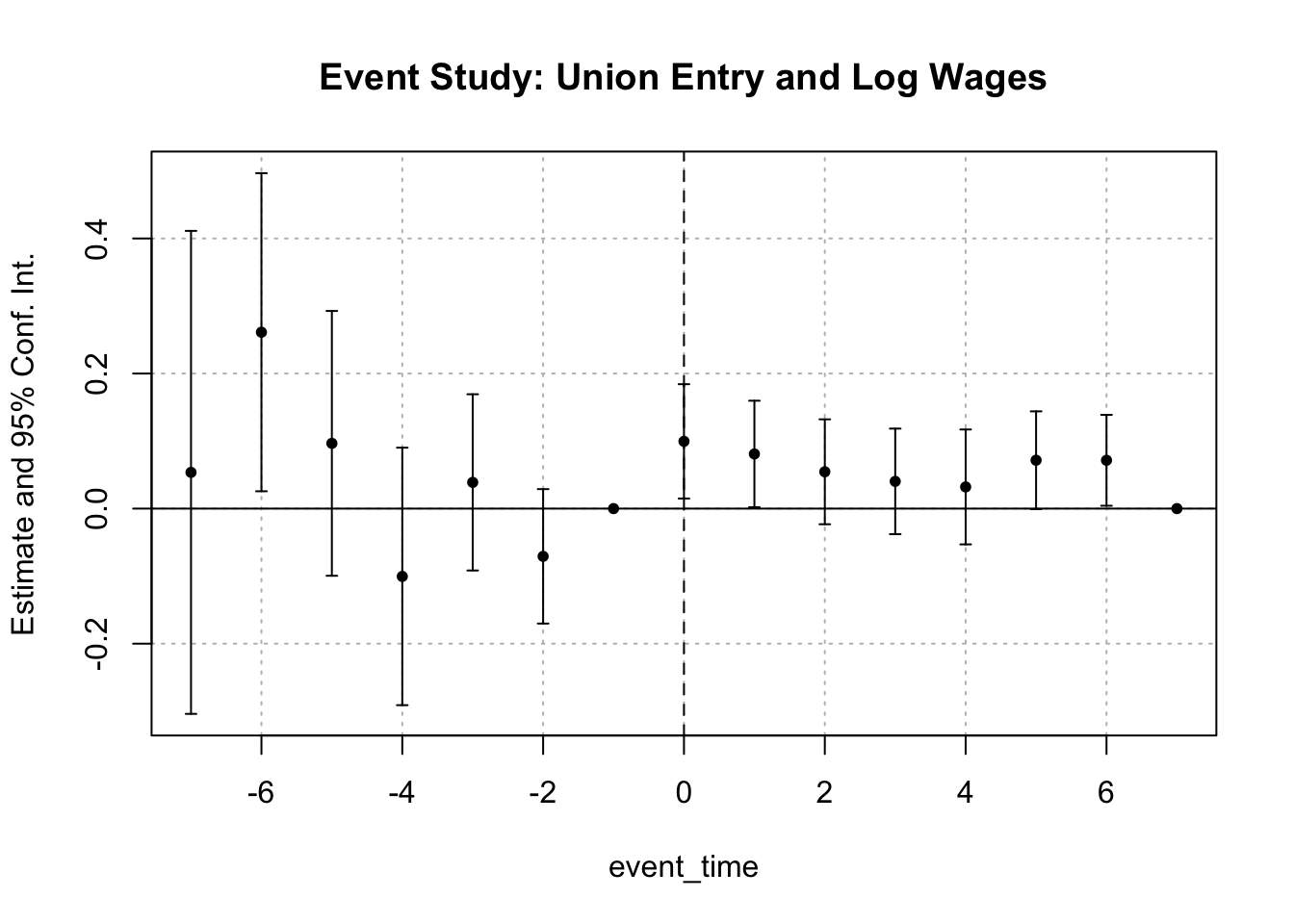
20.1.1 Event Study in Practice: Union Entry and Wages
We’ll use the wagepan dataset from the wooldridge package. This dataset tracks 545 men from 1980 to 1987, recording their wages and union status each year.
We define the “event” as the first year a person joins a union.
# Identify first year of union membershipfirst_union <- wagepan %>%group_by(nr) %>%filter(union ==1) %>%summarise(first_union_year =min(year), .groups ="drop")# Merge with main data and compute event timewagepan_evt <- wagepan %>%left_join(first_union, by ="nr") %>%mutate(event_time =ifelse(!is.na(first_union_year), year - first_union_year, NA))
We’ll keep only individuals who ever joined a union to estimate dynamic effects.
Read the first two pages of the paper “Punishment to promote prosocial behavior: a field experiment” posted to Canvas > Modules > Module 2 > VS2024.pdf. Summarize in a few sentences the idea behind the experiment in that paper.
Go to Canvas. Download waste.dta from Modules > Module 2 > Datasets. Save the dataset to a convenient folder and open it in your script.
Explore the data. Get a sense for the units of analysis, the variables, whether the data are wide or long, and how many units are in the treatment and control groups. We are interested in the otucome residual_weight, which measures the amount of garbage. For a given route, the variable treatment “turns on” (that is, goes from 0 to 1) when the households on the route receive the announcement of the inspections.
We want to create a variable called weekstart that contains the value of calendar_week for which a particular route went from 0 to 1. Create this variable. This is tricky! Hint: Think about first constructing a variable that is like calendar_week but for all rows when treatment is 0, it takes a very large value. Then, create weekstart by taking the minimum of that variable.
Create a variable called eventtime that is centered (i.e., 0) around when treatment begins, by route. It should be 0 one period before treatment begins (the variable treatment goes from 0 to 1).
Graph the variable eventtime. You can use the below code. Notice that we observe many observations between -20 and 20, but there are some observations observed beyond those periods. This can pose an issue because we want to have enough data at each of our event times to be able to estimate the regression well.
ggplot(data = waste) +geom_bar(aes(x=eventtime)) +labs(x ="Event Time", y ="Count") +theme_bw()
Bin event time. You can use cut or ifelse. Create a bin for values less than or equal to -37. Create a bin for greater than or equal to 28. Everything else should remain as it is. That is, the values should be: -37, -36, -35, …, 26, 27, 28. Once you create the variable, turn it into a factor and use relevel to change the reference point to 0. We want to do this because we want to exclude 0 from the regression below. That is, we want all estimated values relative to the value at event time 0.
\(Y_{it}\): this is the outcome variable and should be residual_weight
\(\tau\): event time, at \(\tau = 1\), treatment begins
\(W_{i\tau}\): indicator that is 1 if route \(i\) has event time \(\tau\)
\(\lambda_i\): unit fixed effects
\(\mu_t\): time fixed effects
To do this, use your usual lm(). The right hand side should include eventtime_bin, unit, and time fixed effects.
Look at your estimates for eventtime_bin. What do you notice about the estimates as the event time goes from negative to positive?
This is going to be way more striking as a plot. Use the below code to extract the coefficients from the regression into a manageable dataset. There are complex data operations here that we have not learned about in class. If you are interested, try to figure out what each line does. Note that you need the tibble and stringr packages. The object regout is the object from summarizing the output of question 8. Using the critical value 1.96, create two variables in this dataset that take the lower and upper values of the 95% confidence interval.
Create a plot with event time as the horizontal axis and the estimated coefficient as the vertical axis. There should be a point for every estimate at each event time. Use geom_errorbar() to add the 95% confidence intervalus. Note that in aesthetics you will need to specify x as event time, ymin (the minimum y value) and ymax (the maximum y value). You can go to the help for that function and scroll to the bottom to see examples.
What is your takeaway about the effectiveness of this type of intervention to induce people to separate their trash and recycling?